Issue No. 01 — Cairo · Vol. 2026

01 / 03

Presented by Jomana Tarek

creative folio ✷

Graphic Designer

PORTfOLIO

01Branding
02Visual Identity
03Illustration
04Motion

I enjoy turning ideas into thoughtful visual solutions through branding, illustration, and digital design—creating work that is both functional and visually memorable.

Jomana Tarek — Portfolio 2026scroll
Brand DesignIllustrationEditorialCharacter DesignStoryboardingMotionCairo → WorldType as TextureArt DirectionBrand DesignIllustrationEditorialCharacter DesignStoryboardingMotionCairo → WorldType as TextureArt Direction
Chapter 01 — About02 / 03

Chapter 01

ABOUTMe

Jomana Tarek — Cairo
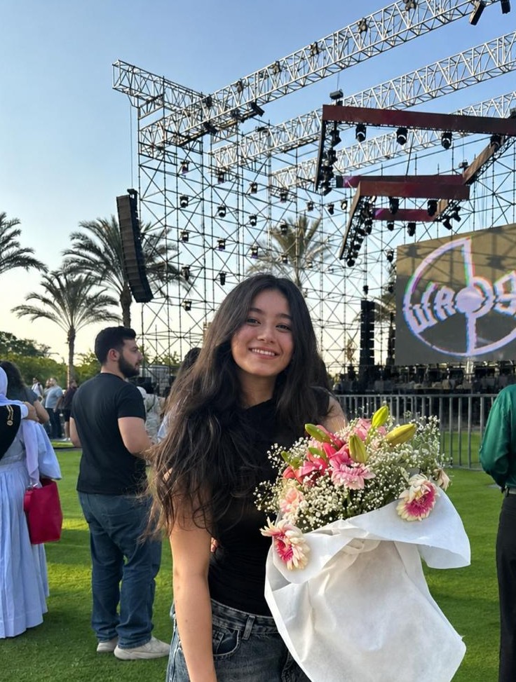
hi, that’s me ✷

Hi, I’m Jomana Tarek

A multidisciplinary designer passionate about building thoughtful visual experiences that tell a story.

Whether I’m creating a brand identity, designing a website, illustrating characters, or bringing ideas to life through motion, I’m always looking for the balance between creativity and clarity.

I enjoy exploring different design disciplines because each one teaches me a new way of thinking — the strongest work is built with intention, curiosity, and attention to detail.

I believe the best design isn’t just visually appealing — it tells a story, solves a problem, and leaves people with something memorable.

Chapter 02 — Contents03 / 03
Index / Vol. 01 / 2026keep scrolling
Education

Academic
Foundations

Helwan University (applied arts)

Digital Advertising design

2023 — 2028

New Vision International School

International Baccalaurate

2022

Greenland Prevert International School

International Baccalaureate

2014 — 2020

Languages

Linguistics

  • ArabicNative
  • EnglishFluent
  • FrenchInermediate
Experience

Experience

— Professional

Nov 2022 – Jan 2023

Social Media Intern

AIWA Group

Contributed to the company's digital content and product communication by creating marketing materials and user-focused resources. Designed instructional tutorials in Figma to improve app usability and produced promotional graphics for the marketing team, while also assisting with data entry and content organization.
Feb 2023 – Mar 2023

Sales & Marketing Intern

Nardi Elettrodomestici

Conducted market research and competitor analysis to support the company's expansion into the Middle Eastern market. Gathered and organized insights to help identify market opportunities and inform strategic business decisions.

Apr 2023 – May 2023

Graphic Design Intern

Brand

Designed and contributed to the company's product catalogue, ensuring a cohesive visual identity and clear presentation of products as the brand entered the Egyptian ovens and grills market.

Disciplines

A curated practice

Eleven overlapping fields — one continuous way of thinking about design.

Graphic Designbrandingdigital advertisingillustratorsoccial media marketingcharacter designmotion graphics2d animationweb designUI/UX designprint media

Tools I use, ideas I create

Software
& Tools

A curated collection of software and tools that power my creative process across branding, design, animation and beyond.

Illustrator · Photoshop · After Effects · Premiere Pro · InDesign · Moho · Figma · Canva

Vector & Brand

Ai

Illustrator

Vector design, logos, icons, illustrations and brand assets.

Image & Retouch

Ps

Photoshop

Image editing, retouching, compositing and color grading.

Motion Graphics

Ae

After Effects

Motion graphics, visual effects and animation.

Video Editing

Pr

Premiere Pro

Video editing, color correction and audio refinement.

Editorial Layout

Id

InDesign

Editorial design, layouts, print-ready documents.

2D Animation

Mo

Moho

2D character animation and rigging.

UI & Prototyping

Fi

Figma

UI design, wireframing and interactive prototypes.

Quick Comms

Cv

Canva

Social media design, presentations and quick creative assets.

Chapter 03 — The Exhibition

Seven worlds,
one hand.

Each project has its own colour world, layout language, and pace — but every one follows the same arc: problem, concept, process, system, applications.

01 / Brand Identity

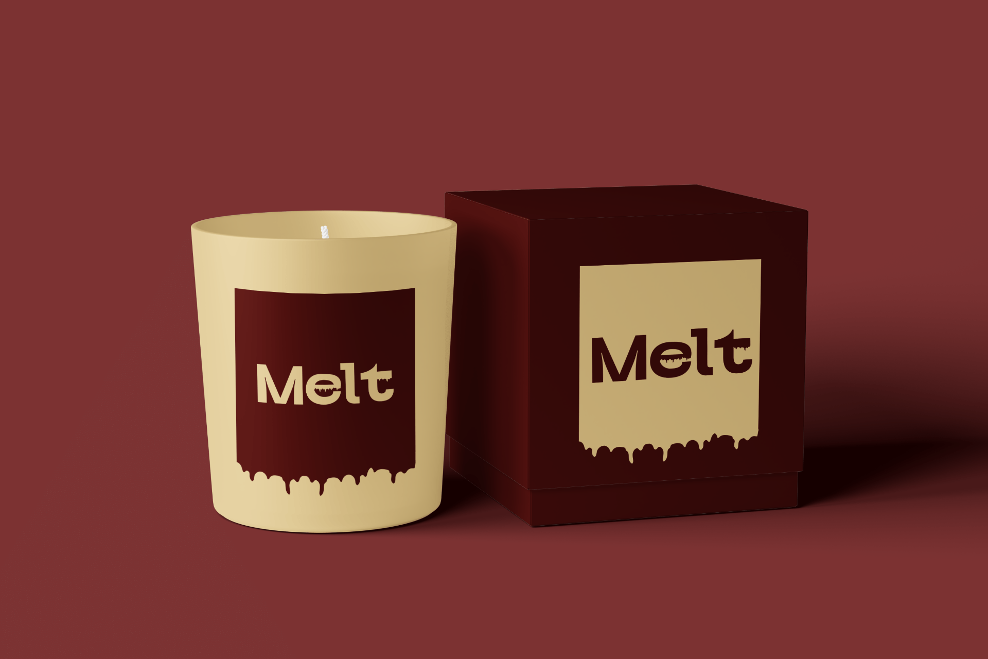
Melt packaging

02 / Visual Identity

YAPP system

03 / Web Design

House of Hypatia

Project 01Self-Initiated ConceptHome Fragrance · 2025

Slow down. Soften.
Stay a little longer.

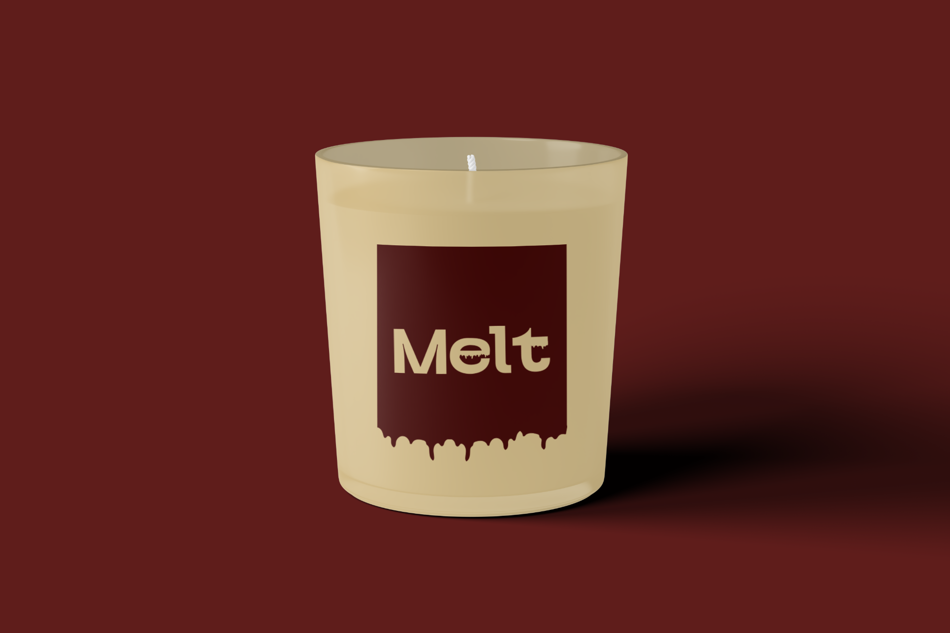
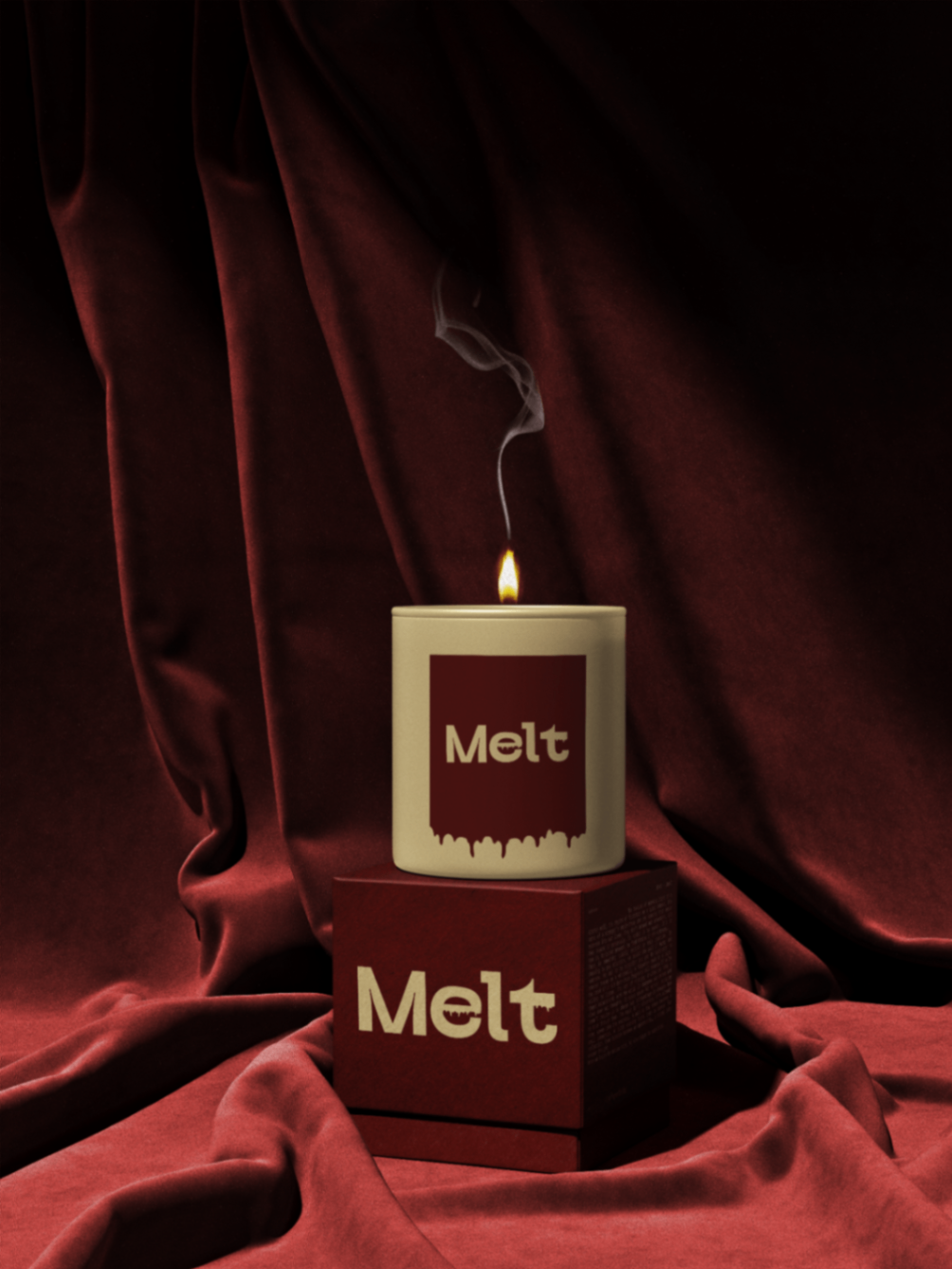
Melt candle on velvet — atmospheric hero

A ritual,
not a product.

The story

An everyday ritual, quietly designed.

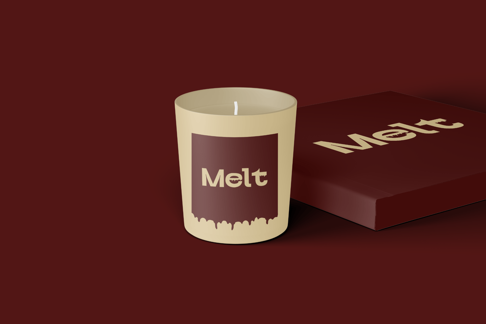
Melt translates the feeling of unwinding into warm earthy tones, generous space, and a melted wordmark whose lower edge softly drips — wax in motion, stress gently letting go.

The visual system stays minimal so the product can breathe. Sophisticated, comforting, timeless — with a single playful detail in the type that keeps it human.

Melt candle with packaging — editorial shot
Colour palette

Ember Wine

#5A1A17

RGB 90 · 26 · 23

Warm Wax

#F0E0B5

RGB 240 · 224 · 181

Soft Amber

#E8D49A

RGB 232 · 212 · 154

Melt candle close-up

“Light it. Breathe. Stay.”

Melt candle with box, perspective view
Next → YAPP · Bold identity▼
Project 02Self-Initiated ConceptCafé Identity · 2024

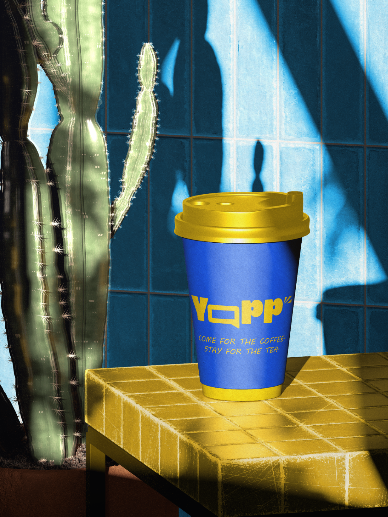
Come for the coffee.
Stay for the yap.

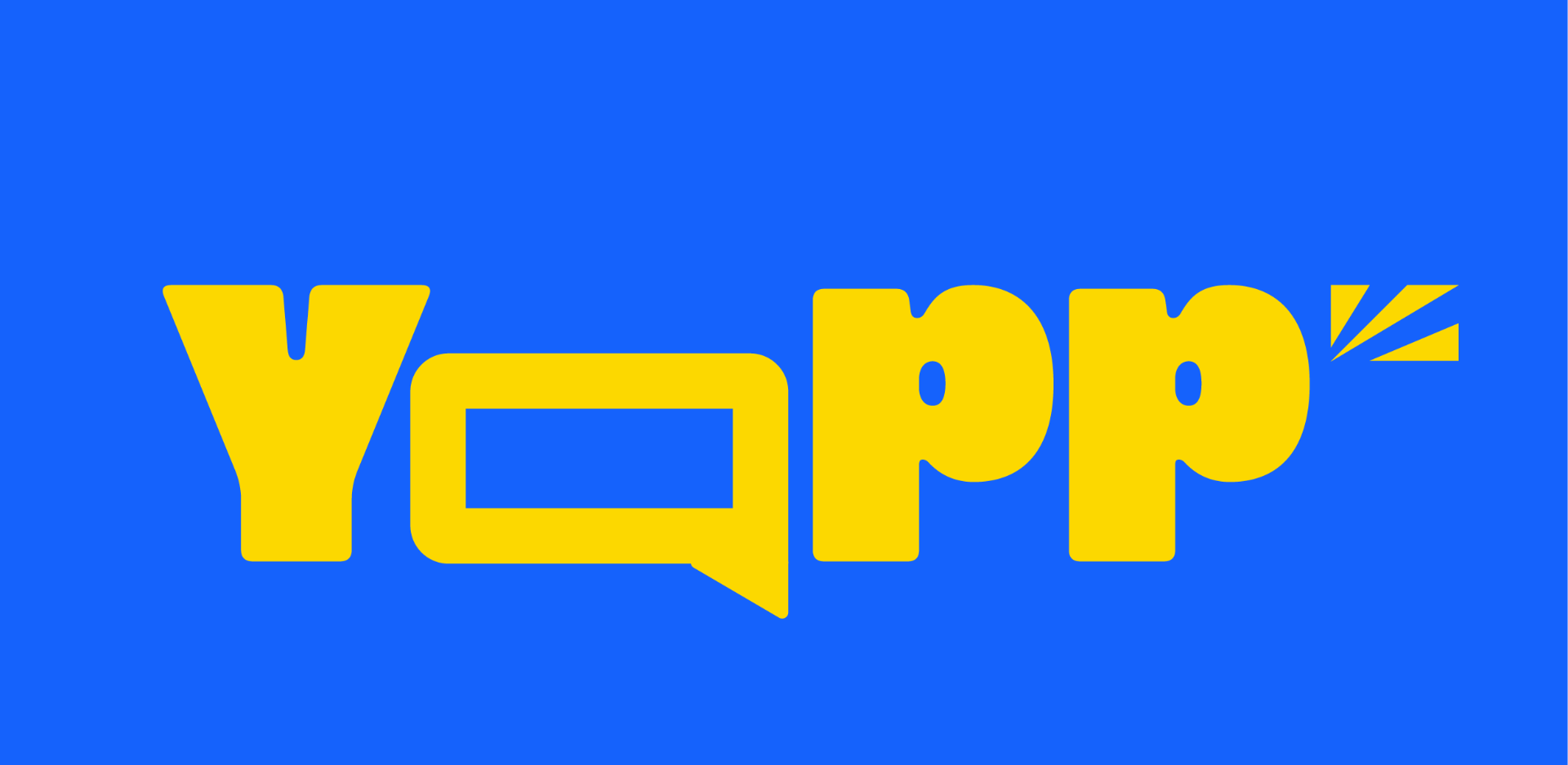
YAPP — primary wordmark, yellow on blue
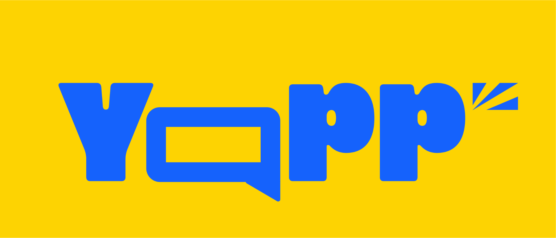
YAPP — inverted wordmark, blue on yellow
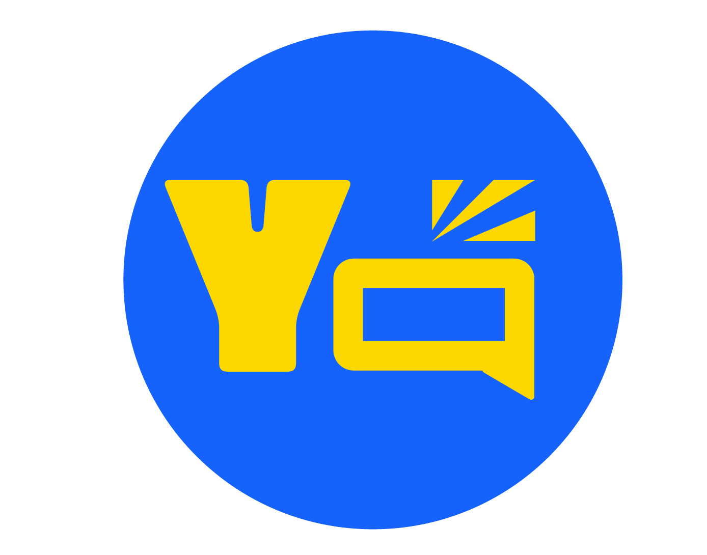
YAPP — circular submark, yellow on blue

Logo system — three variations, one voice

An imaginary café where the drink is the excuse and the conversation is the point — a brand built for long talks, life updates, and the “one more thing” that turns into another hour.

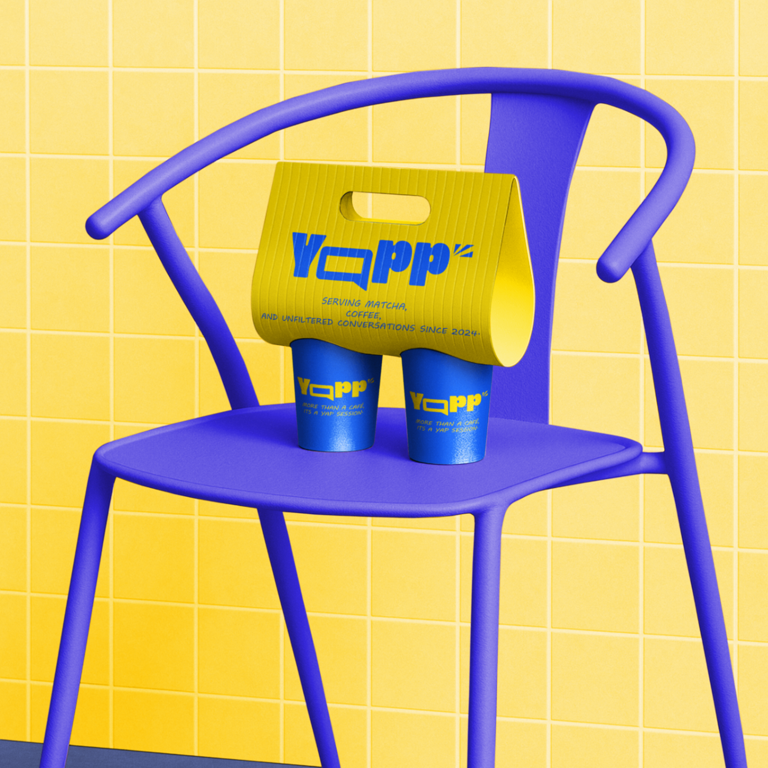
YAPP packaging — drink carrier on a chair

The story

More than a café — it’s a yap session.

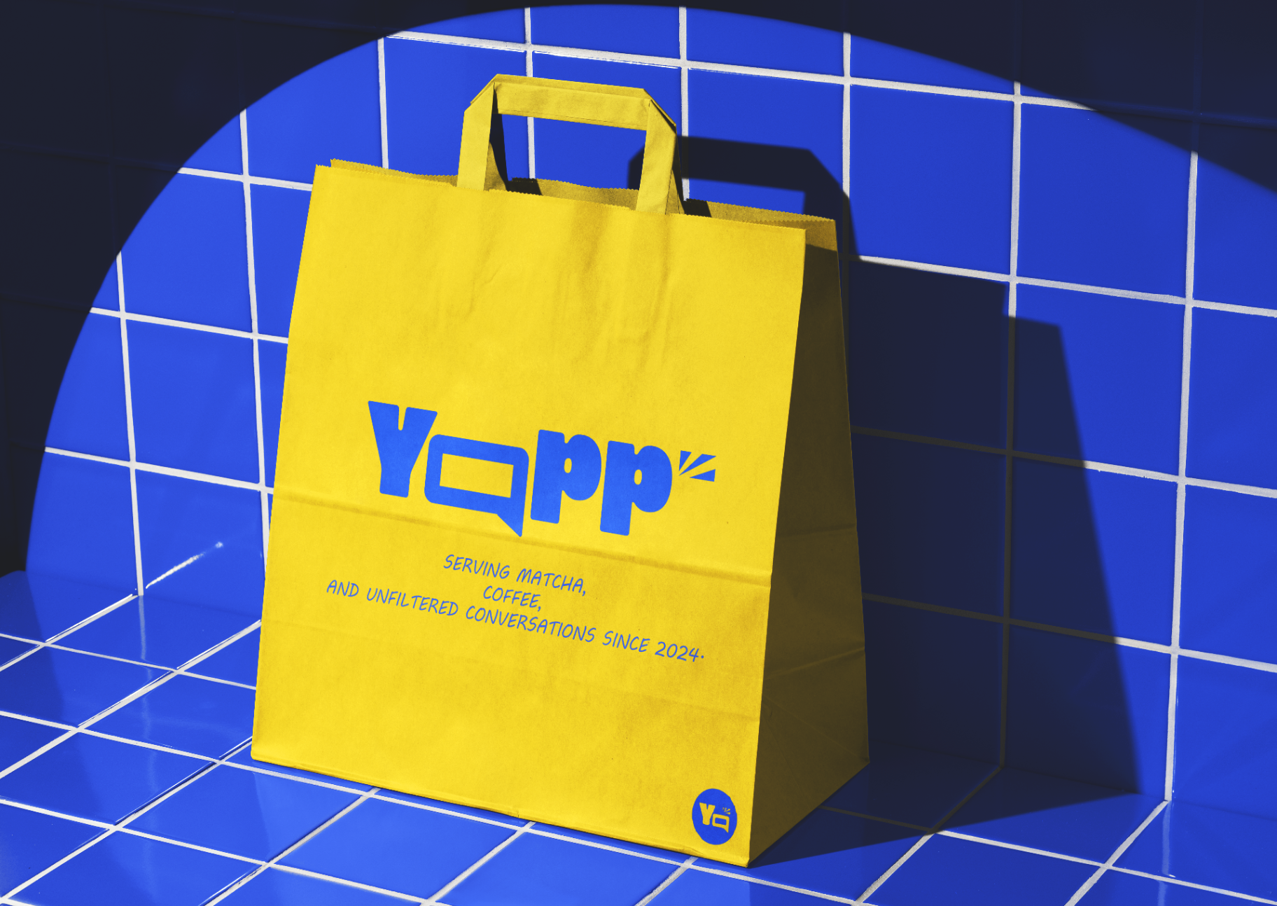
YAPP positions itself as a welcoming social space where the conversation is just as important as the drink. The visual identity translates that energy into bold display type, two electric brand colours, and a chat-bubble “A” that hides inside the wordmark — a tiny pun you spot a second time.

Friendly, loud, and a little chaotic in the best way: speech-bubble graphics, hand-drawn captions, expressive contrast, and packaging that looks like it wants to talk back. Designed for a Gen Z audience that treats their café table like a stage.

LOUD.

WARM.

HONEST.

A LITTLE CHAOTIC.

YAPP shopping bag in the wild
Colour palette

Yap Blue

#2540FF

RGB 37 · 64 · 255

Loud Yellow

#FFCC00

RGB 255 · 204 · 0

Ink Black

#0A0A0A

RGB 10 · 10 · 10

YAPP coffee cup hero shot
Design highlights

Bold display type

Chunky, friendly, made for shout-out moments.

Chat-bubble logo

The wordmark hides a speech bubble in plain sight.

Two-colour system

High-energy blue and loud yellow, no compromise.

Conversational copy

Voice that feels like a text from a friend.

Sticker-forward identity

Every surface is a place to talk.

Premium-playful balance

Polished print, chaotic personality.

Next → House of Hypatia · Knowledge, designed▼
Project 03Brand Identity · Web Design · Editorial2025

knowledge, designed

House of Hypatia

A brand and digital experience inspired by one of history’s greatest thinkers — a contemporary library that feels timeless, intellectual, and warm.

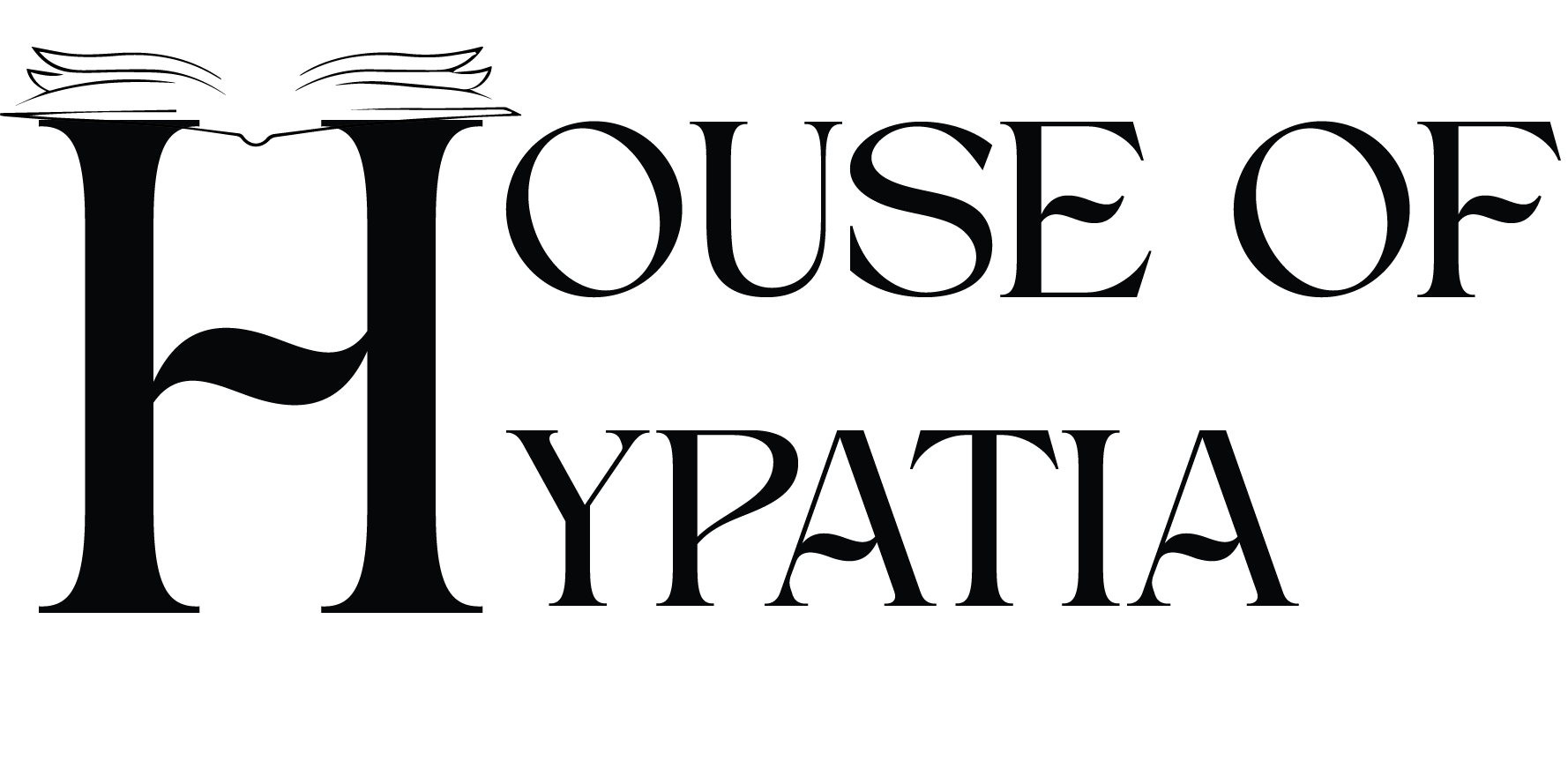
House of Hypatia — primary wordmark

Primary wordmark — open book inside the H

01 · Brand Identity

An elegant serif wordmark where the H opens like a book — referencing libraries, manuscripts, and the act of reading itself.

02 · Visual Language

A warm sepia palette, classical columns, watercolour vignettes, and quiet typography evoking museum and manuscript culture.

03 · Print & Applications

From spine labels and member cards to invitations for talks and workshops — every touchpoint feels like part of a curated collection.

04 · Website Experience

A digital library that scrolls like turning the pages of a beautifully bound book — discovery over information architecture.

Chapter IV · Website Experience

Turning the page on a library, online.

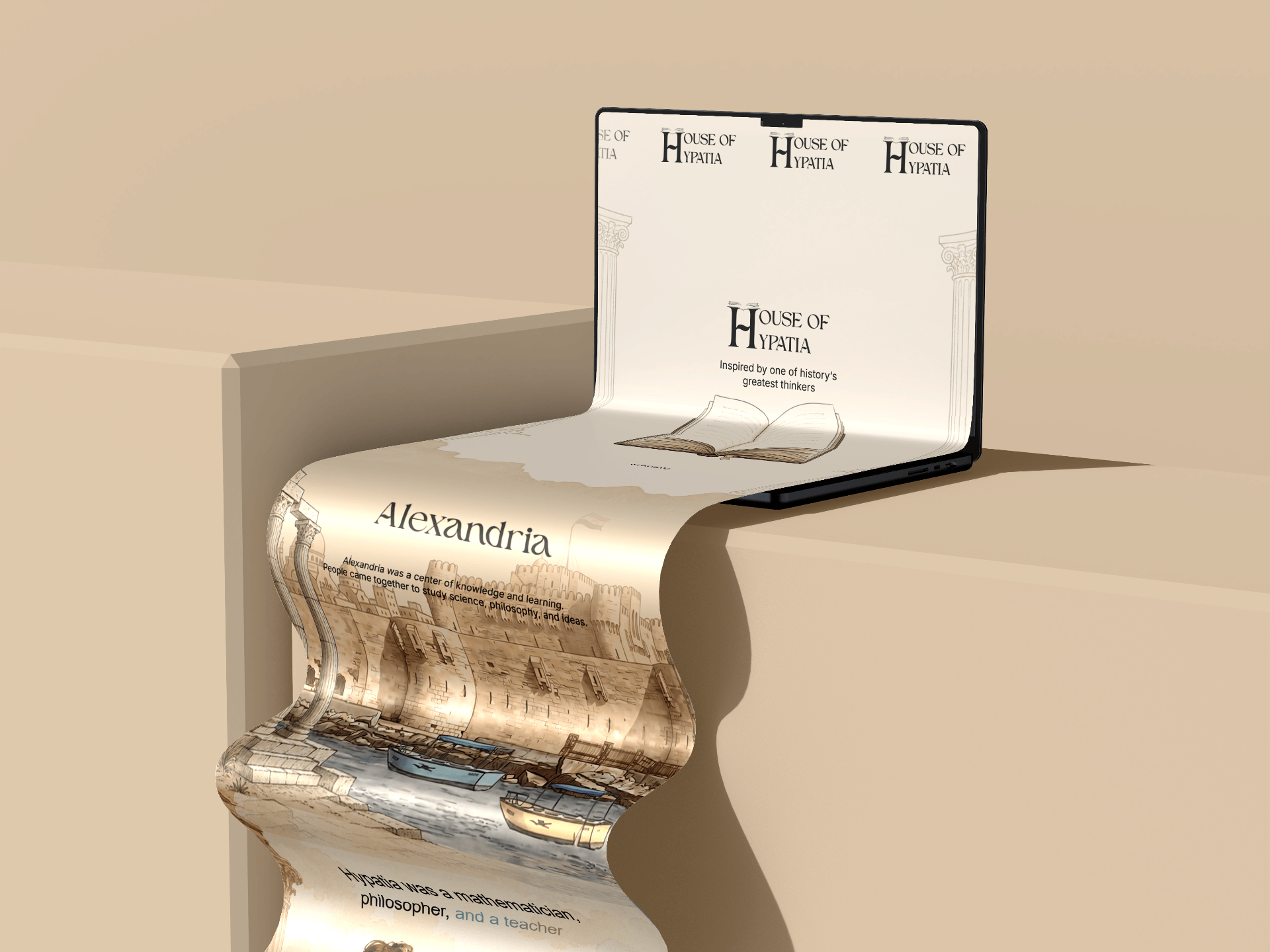
To complete the House of Hypatia identity, I extended the visual system into a digital experience — a website that reflects the same elegance, curiosity, and timeless character established through the brand. The motion is inspired by books, archives, and museum exhibitions, not modern tech products.

Page 01 · Landing — “Alexandria”

House of Hypatia website — landing scroll showing Alexandria illustration

“Knowledge outlives time. Her ideas lived on.”

— a love letter to learning

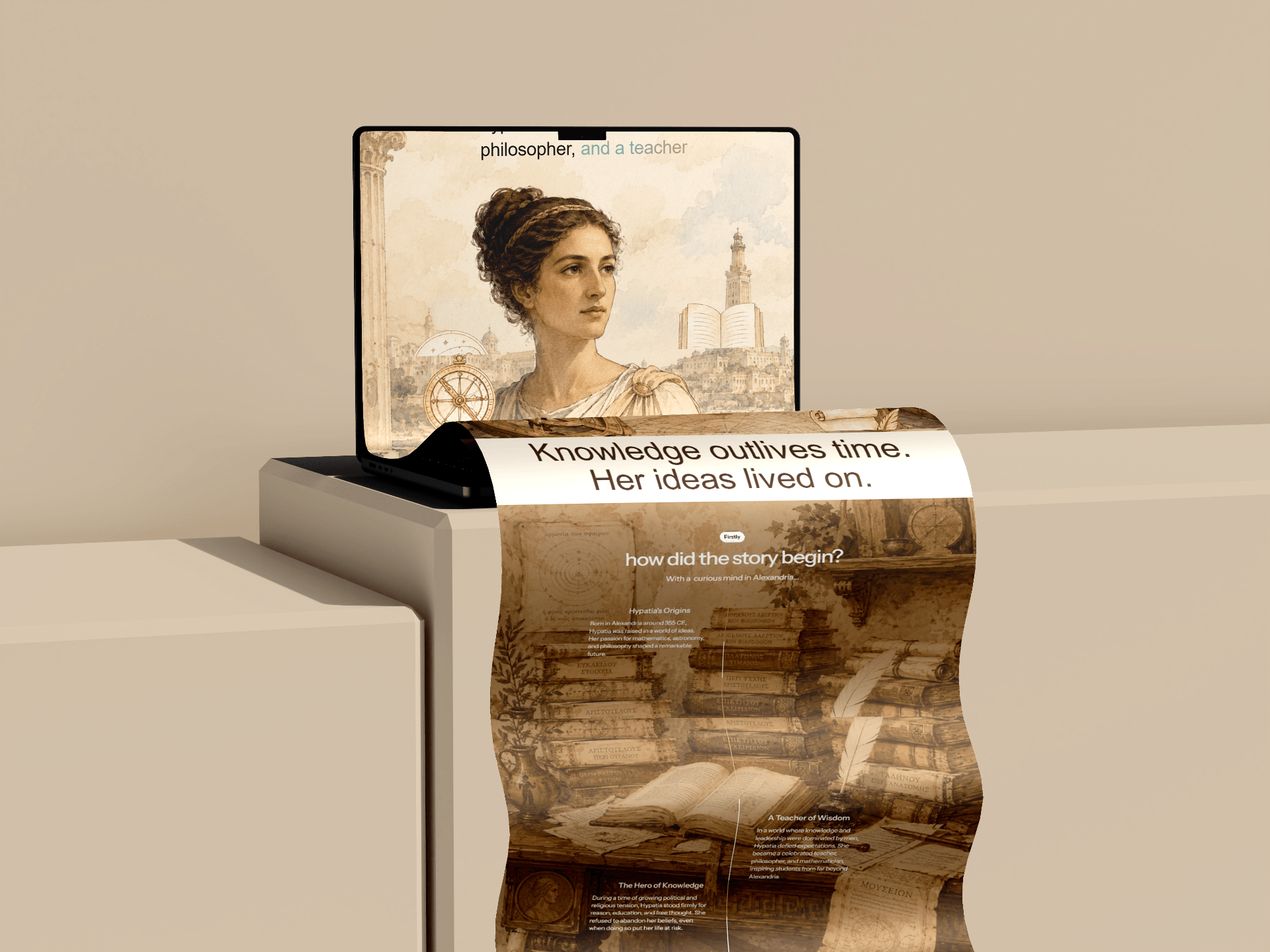
Page 02 · Story — “how did the story begin?”

House of Hypatia website — story page with portrait and historical archive

Editorial pacing

Each section reads like a chapter — generous breaths between ideas, like a printed book.

Atmospheric imagery

Watercolour and historical illustrations sit beside calm, modern typography.

Discovery over UI

Navigation feels like browsing a library shelf, not clicking a product.

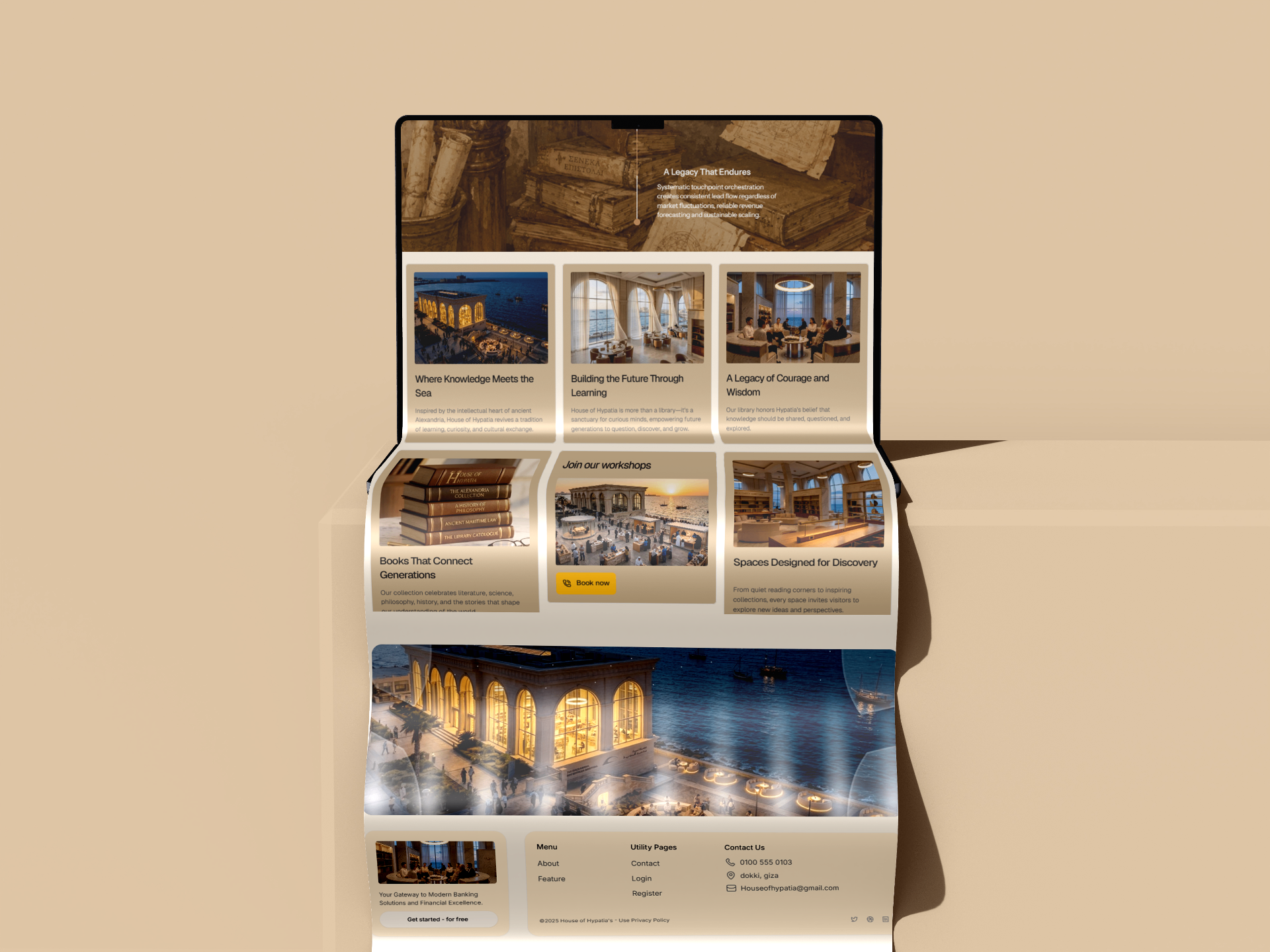
Page 03 · Spaces, books, workshops

House of Hypatia website — spaces, collection, and workshops grid

Final ecosystem

From wordmark to website — a single, quiet, intentional world.

Next → Knot · Made to stand out▼
Project 04Identity · Packaging · Social2025

Knot
Made to stand out.

A handmade crochet bag label that turns leftover yarn into one-of-one pieces. The brand needed an identity loud enough to live on Instagram and warm enough to feel handmade.

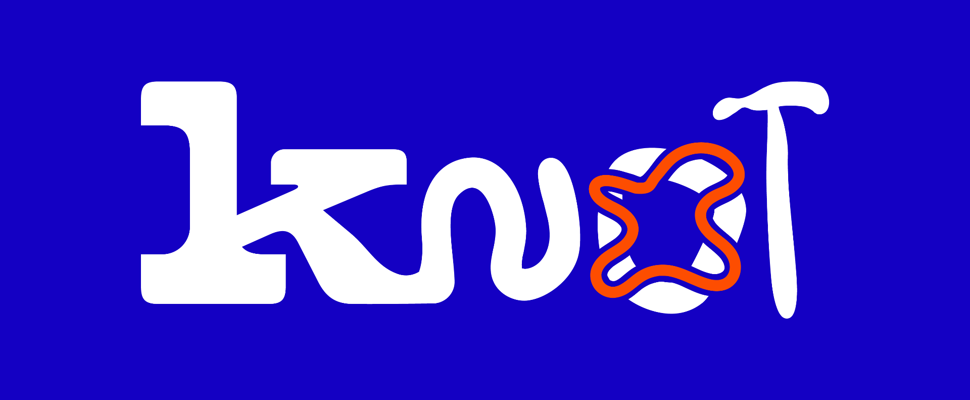
Knot — primary logo

Primary mark — original artwork

01 · Problem

A handmade brand selling colourful crochet bags needed an identity that wouldn’t disappear in an Instagram feed full of beige boutiques.

02 · Strategy

Lean into the chaos. Loud cobalt and orange, a hand-drawn wordmark, and a campaign voice that picks fights with basic.

03 · System

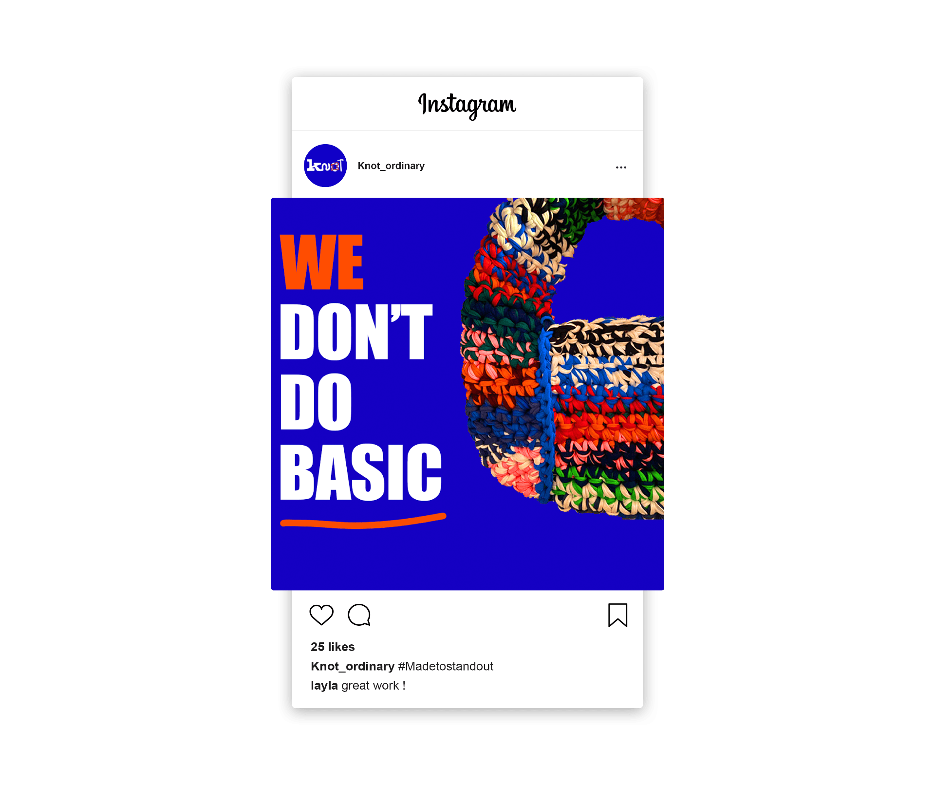
Logo, custom knot symbol, packaging system, and a social campaign built around one line: We don’t do basic.

04 · Outcome

A complete brand world that runs from product to feed to physical retail moments.

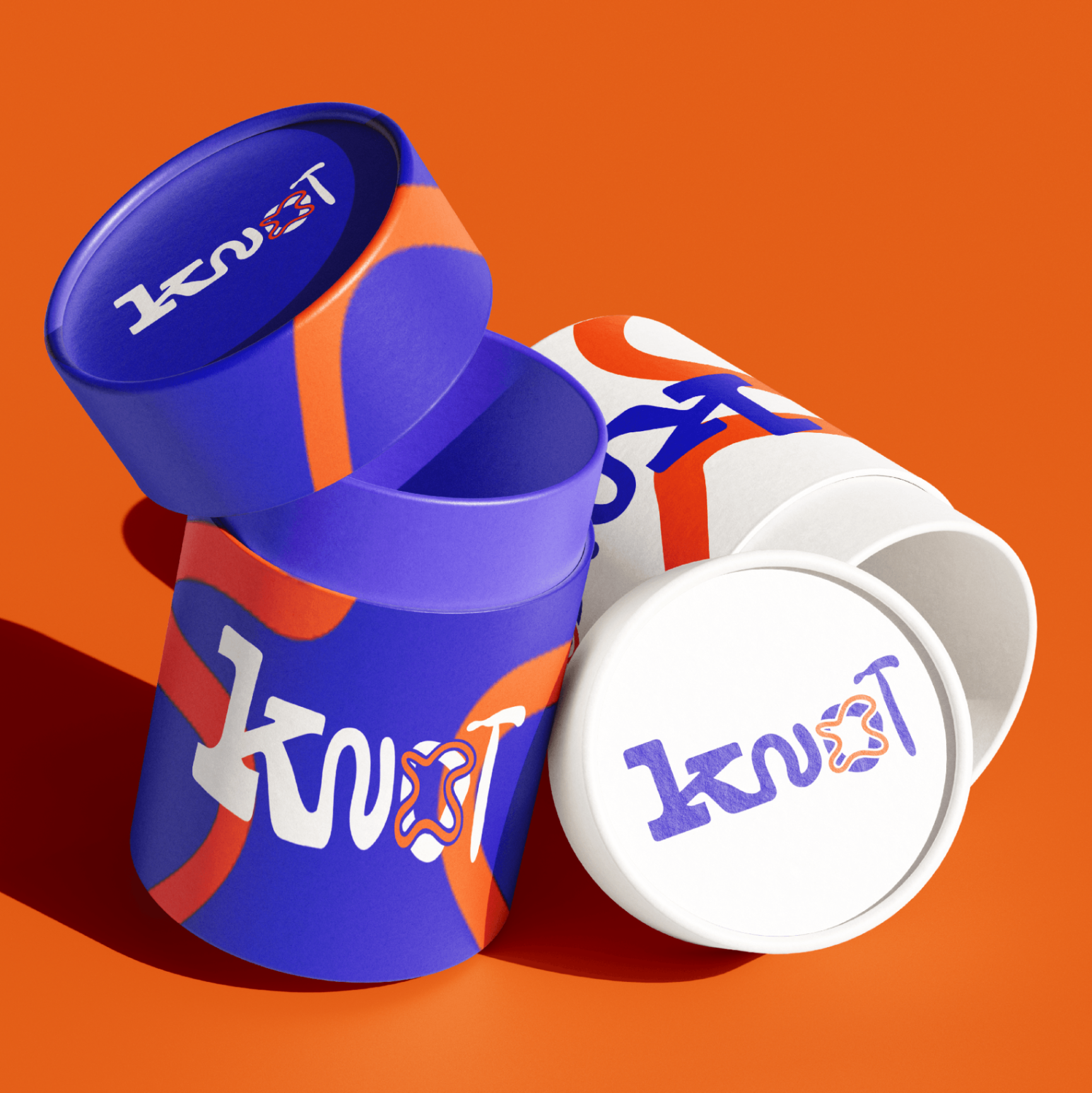
Knot packaging — cylindrical boxes with blue and orange artwork
Social media · #Madetostandout

A campaign that picks a fight with basic.

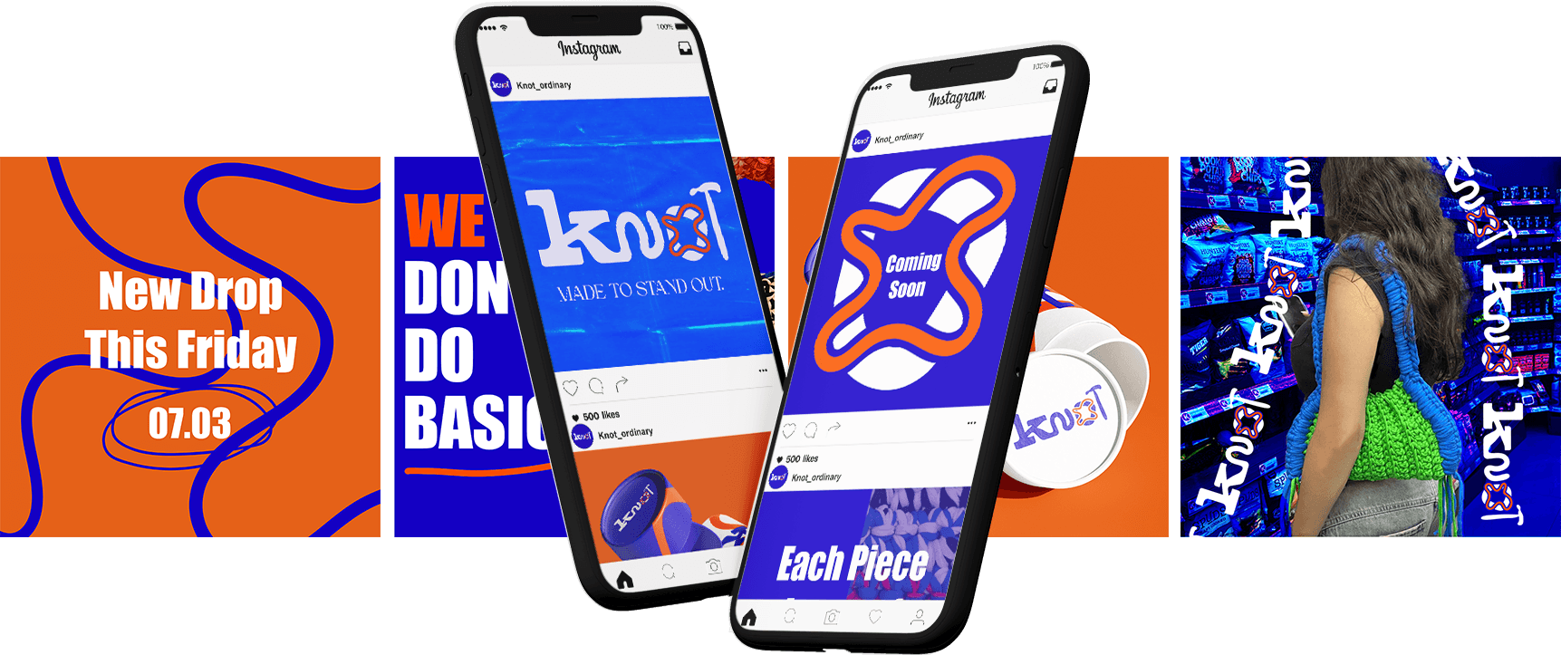
The launch campaign runs on big type, bigger colour blocks, and product photography that looks like it belongs in a music video. Every post is a small poster — designed to stop the scroll, not blend in.

Instagram gridStory templatesLaunch postersPack-out
Knot Instagram post — We don’t do basic
Knot — full campaign sheet, posts and mockups
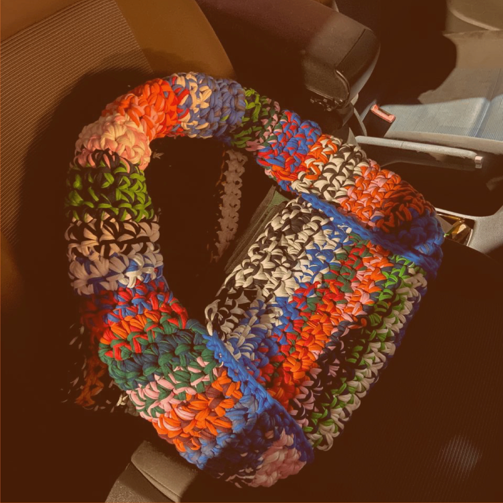
Knot — handmade crochet bag in context

The object

Each piece is hand-crocheted from leftover yarn — no two are ever the same.

The brand celebrates that. The packaging, the campaign, the wordmark — everything was designed to make the wearer feel like they’re carrying a tiny art piece.

Colour palette

Cobalt Shout

#1414C8

RGB 20 · 20 · 200

Loud Orange

#FF5A1F

RGB 255 · 90 · 31

Off Cream

#FFF5EC

RGB 255 · 245 · 236

Next → Diverso · Editorial luxury▼
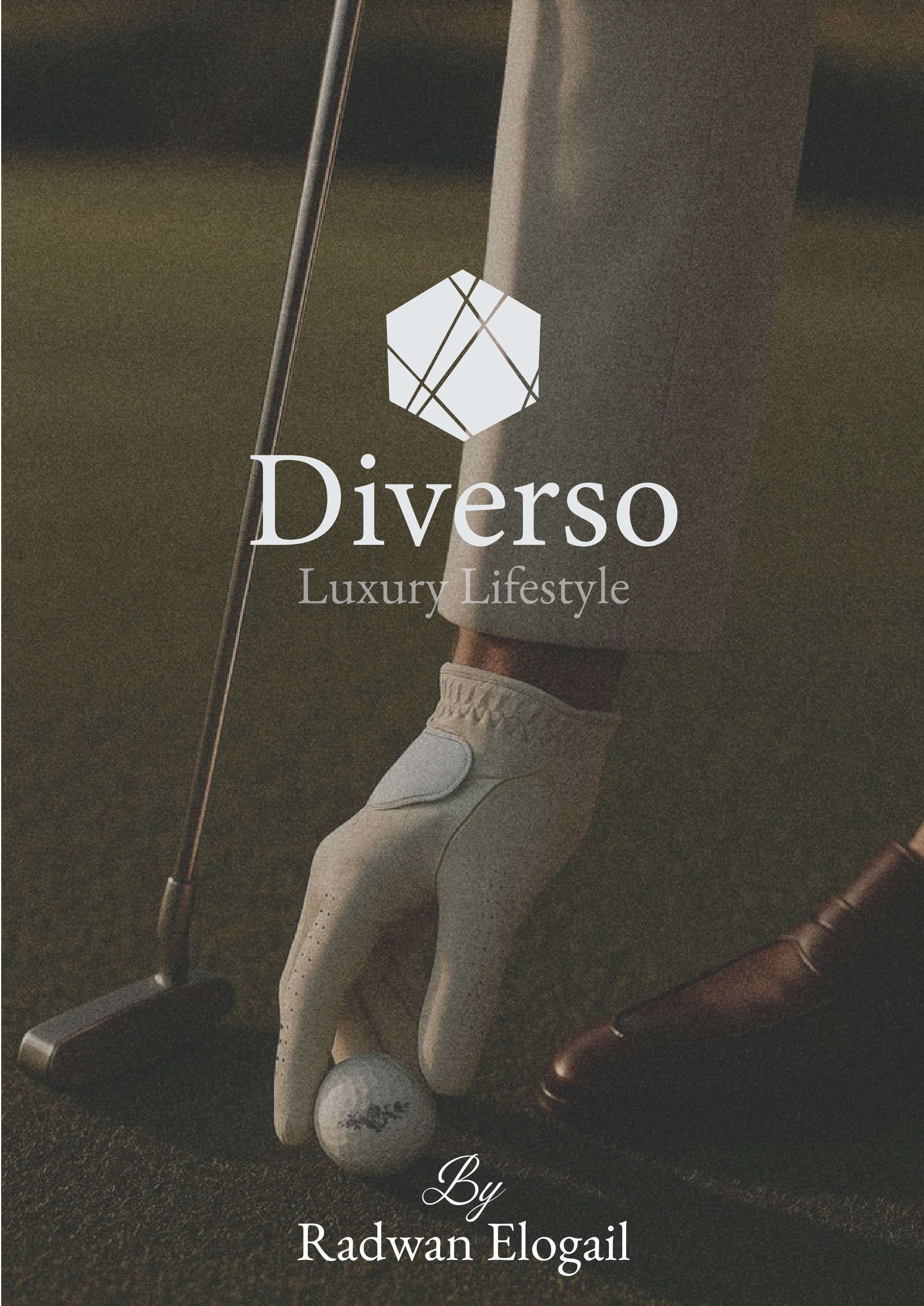
Diverso catalogue cover
Project 05Luxury Editorial2025 · Catalogue

Diverso
Luxury Lifestyle Catalogue

01 · Problem

A premium product range that read like a spec sheet — desire, atmosphere, and pacing were missing.

02 · Concept

Treat the catalogue like a fashion edit. Restraint, generous space, and cinematic image-led pacing.

03 · System

Editorial grid, Instrument Serif headlines, paired with quiet sans for technical specs.

04 · Result

An 8-page catalogue that reads as one continuous spread — embedded in full below.

↳ Full catalogue, scroll inside the frame

Open full PDF ↗
Diverso · 8 spreads

Designed in InDesign · Set in Instrument Serif · 2025

Next → Ebo · Characters & Story▼
Project 06Storyboard · Character · Animation2025

Ebo Biscuits
From script to screen

A playful ad concept built around a familiar snack — planned first as a storyboard, then illustrated as a cast of characters, and finally animated.

Step 01

Concept

Step 02

Storyboard

Step 03

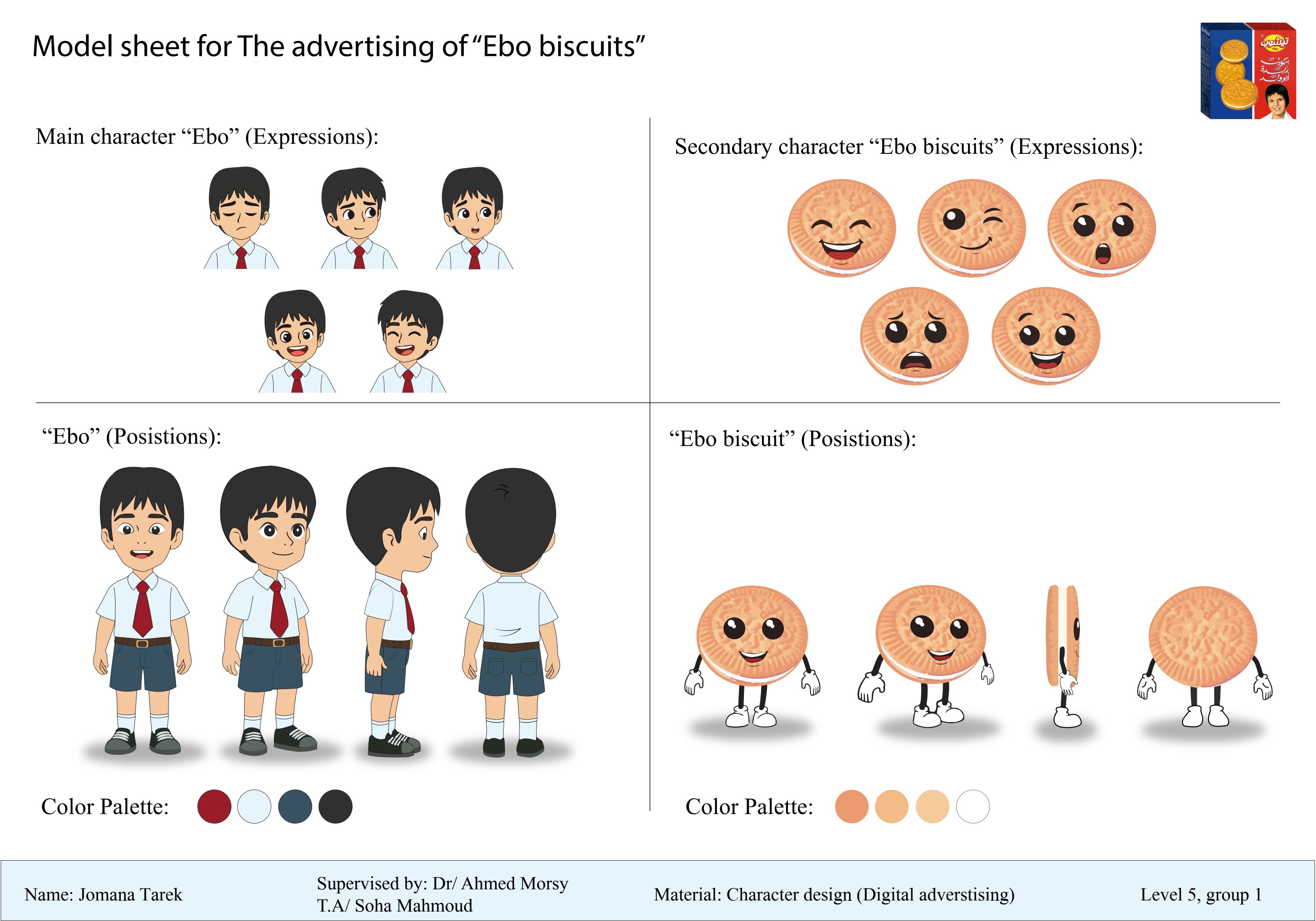
Character Design

Step 04

Animation

Step 02 — Storyboard (process)

Pencil first, polish later.

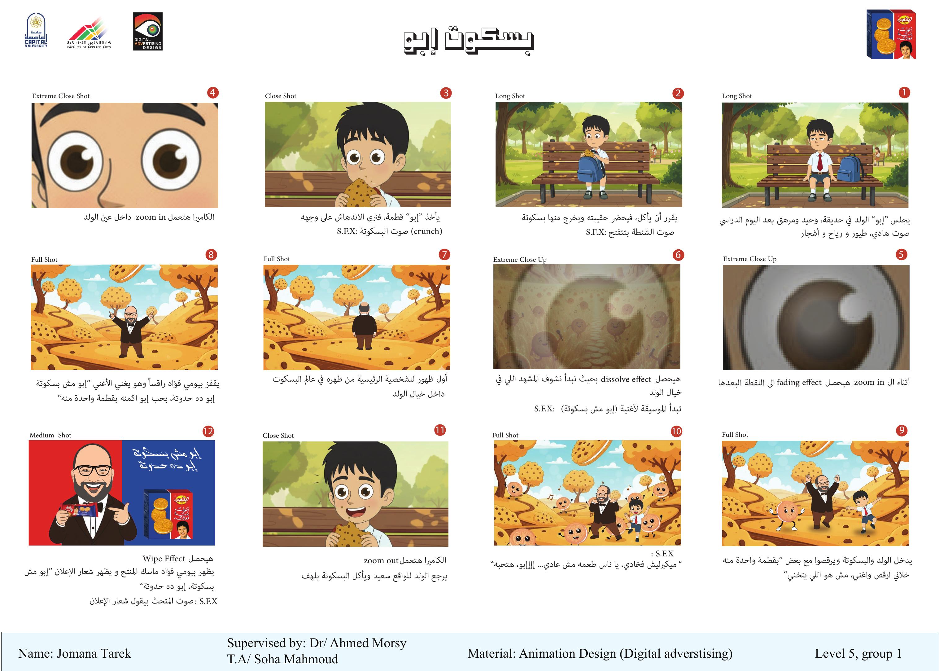
Ebo Biscuits storyboard — planning the ad sequence
Storyboard / one continuous spread

Before drawing a single character, every shot was planned — pacing, framing, and beats. This storyboard is the spine of the whole piece.

Step 03 — Character design

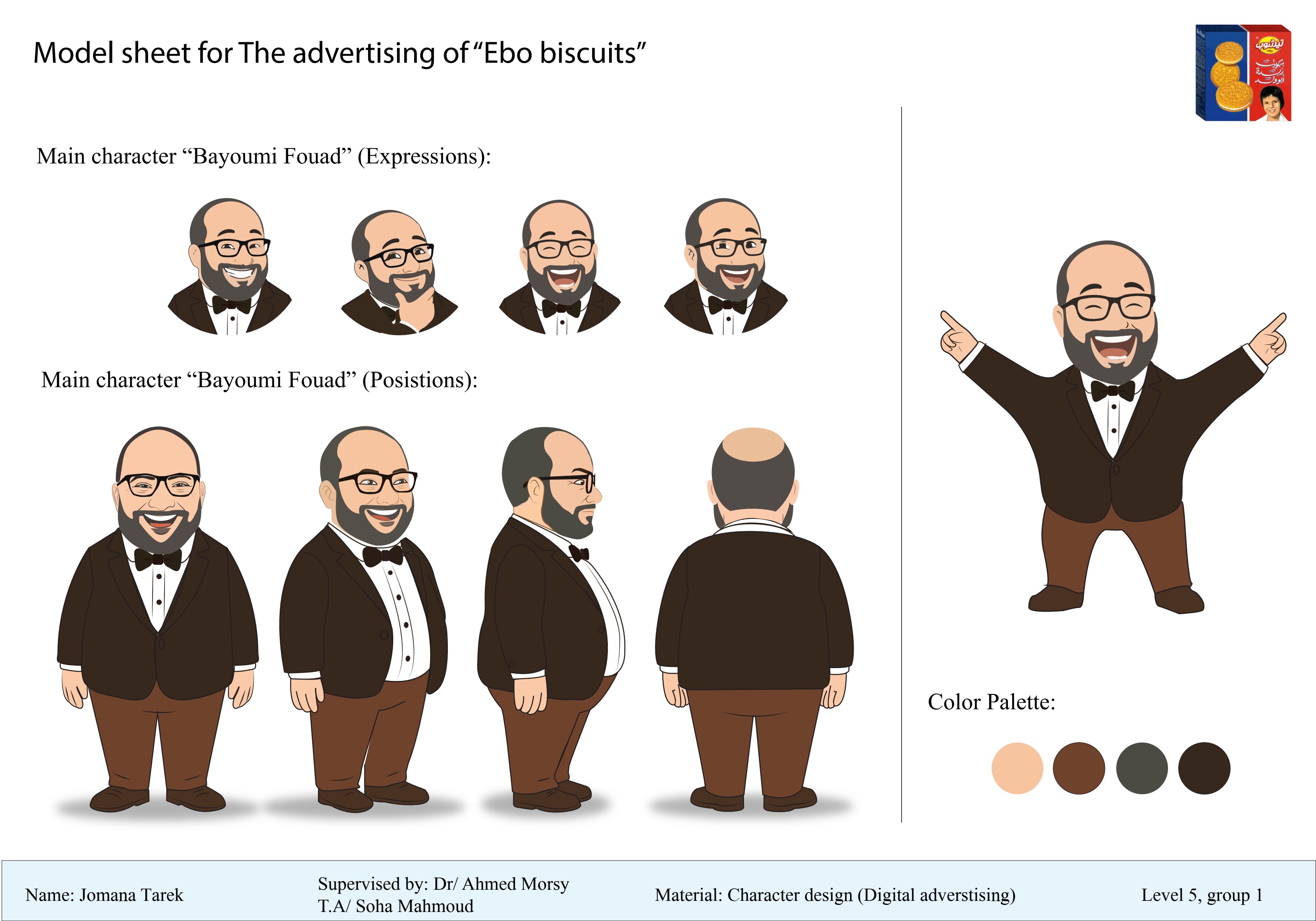
Ebo character sheet 1
Sheet 01 — The cast
Ebo character sheet 2

Step 04 — Animation

From sheet to screen — characters animated in Moho & After Effects, timed against the original storyboard.

The storyboard wasn’t decoration — it was the blueprint. Every cut, expression, and pose in the final animation traces back to a frame on that wall.

Next → Kyoto · Iconography system▼
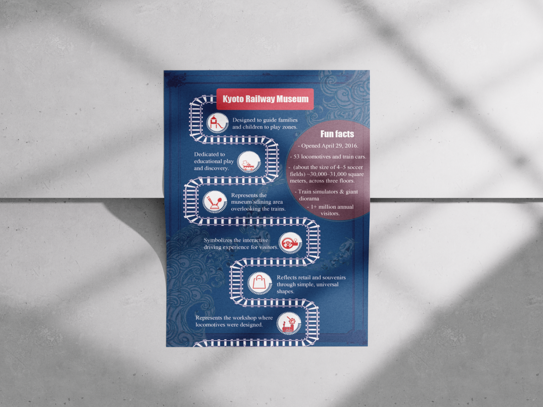
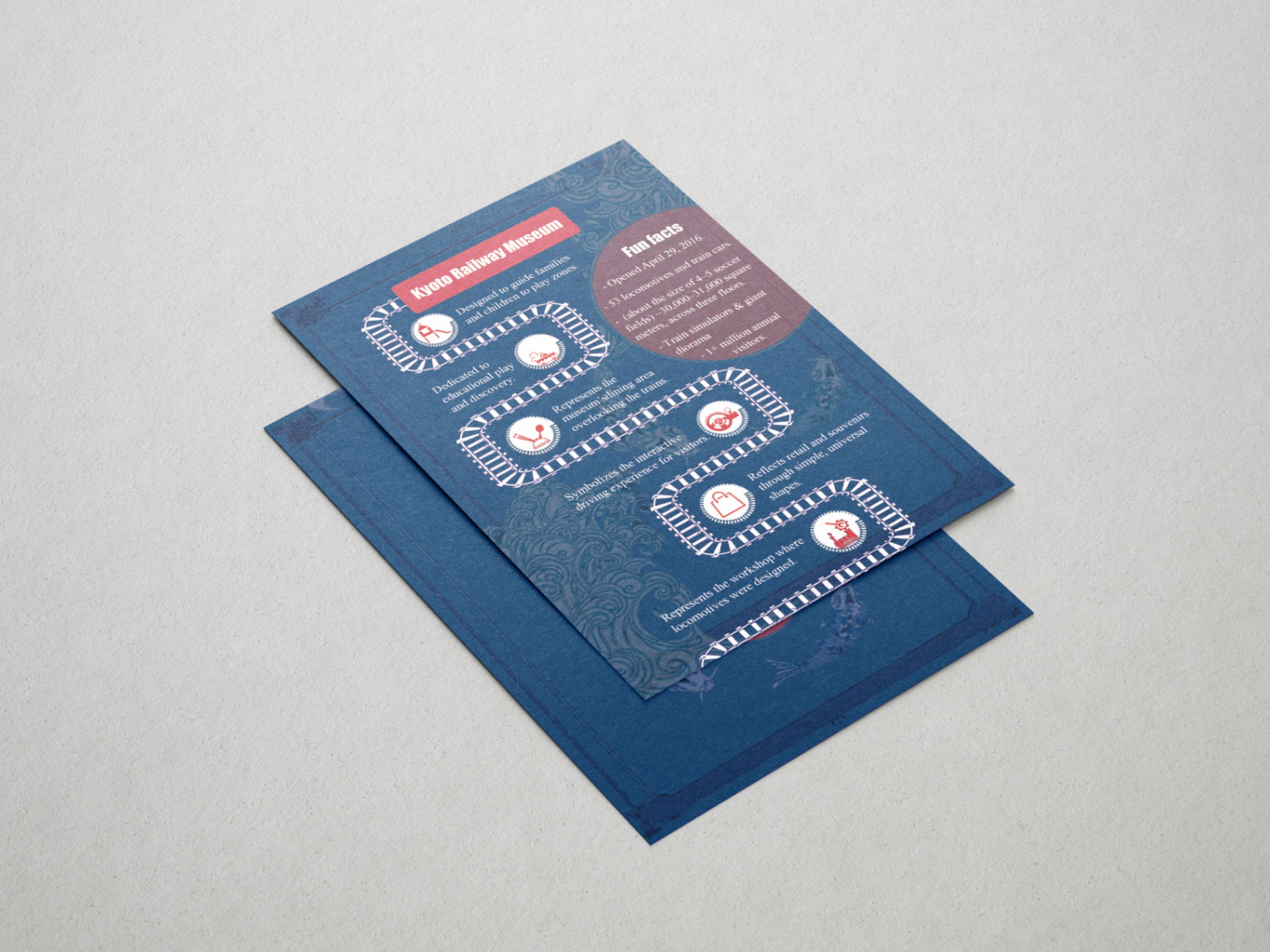
Kyoto Railway Museum wayfinding hero
Project 07Brand System2025

Kyoto Railway Museum
Wayfinding System

01 · Problem

A century of railway heritage that felt heavy, technical, and intimidating to families with children.

02 · Research

Studied historic Japanese signage, train livery, and family wayfinding patterns across global museums.

03 · Strategy

Translate engineering language into warm, playful pictograms — heritage that winks back.

04 · Outcome

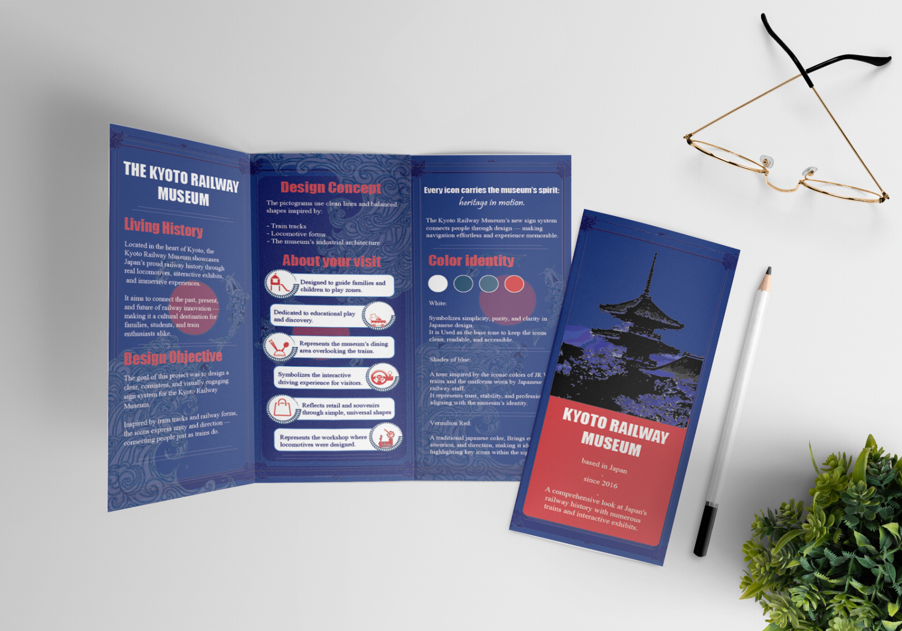
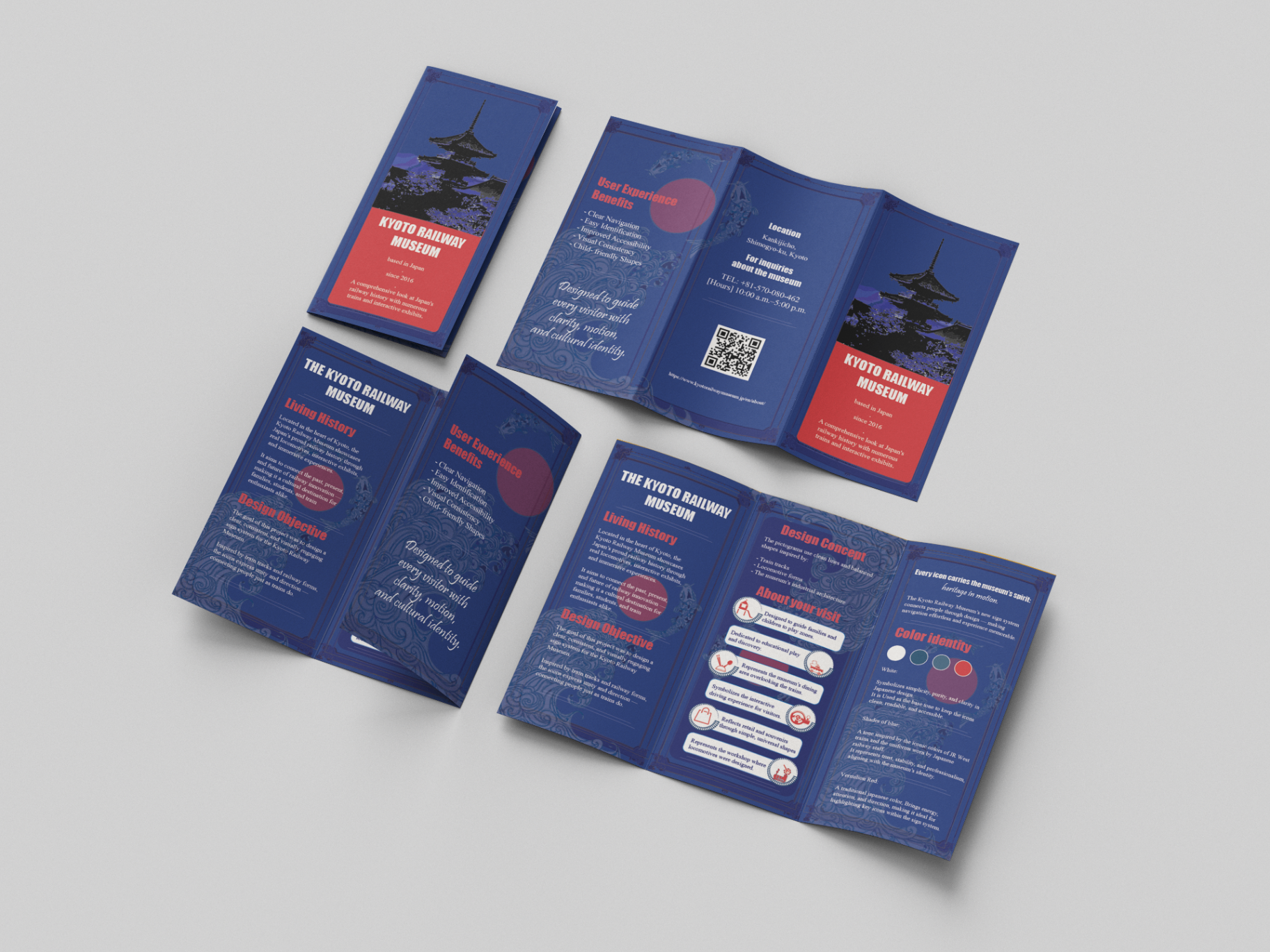
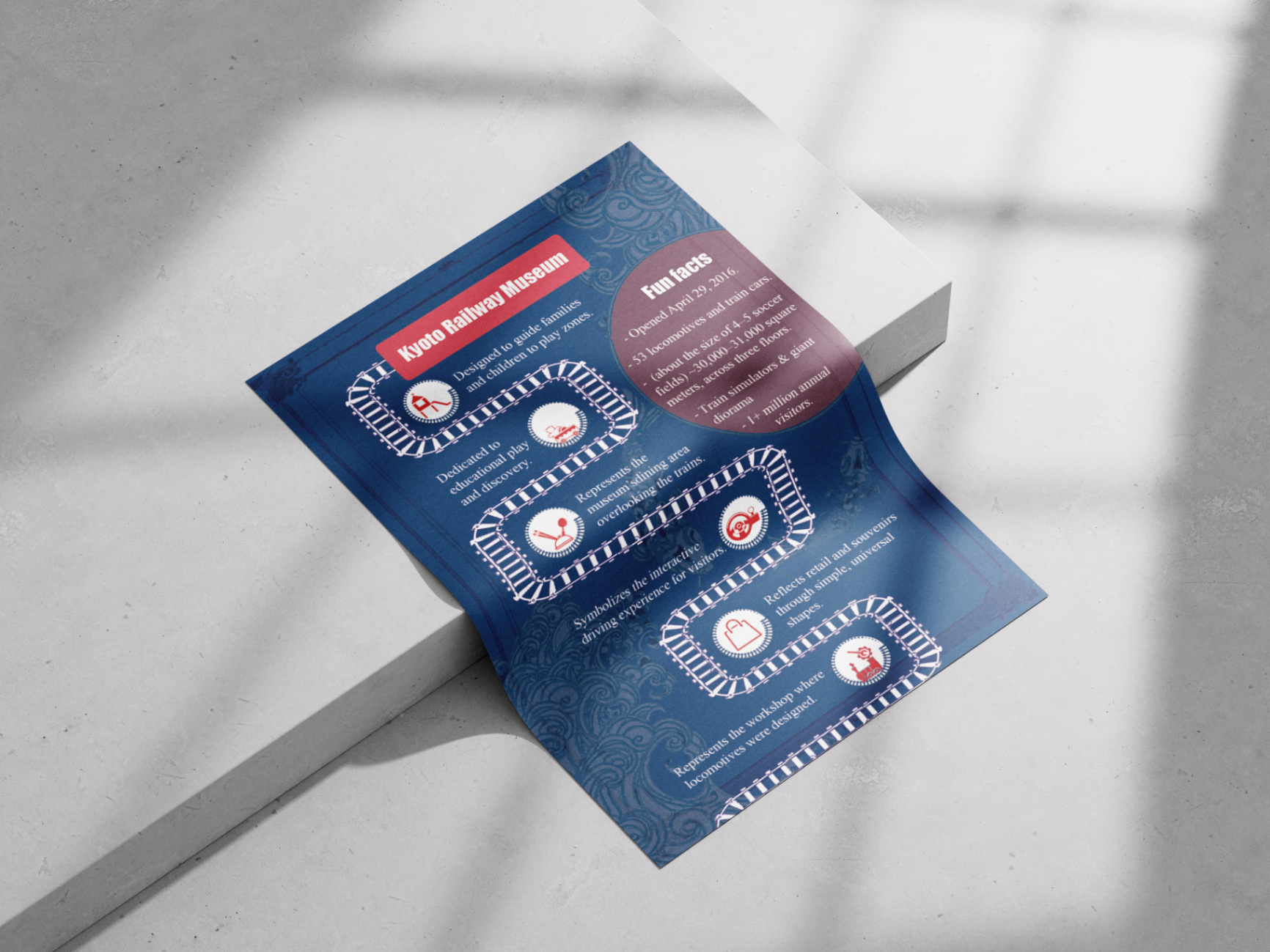
An icon family, color logic, brochure system, and infographics that scale across signage and print.

01 / Palette

02 / Typography

Aa

Instrument Serif · Display

Aa

Instrument Sans · Caption

03 / Voice

“Heritage, but it winks at you.”

Family-friendly. Educational. Confident pictograms paired with warm color logic.

↳ Drag / scroll →

Kyoto detail 1
Plate 01
Kyoto detail 2
Plate 02
Kyoto detail 3
Plate 03
Kyoto detail 4
Plate 04
Kyoto detail 5
Plate 05

Mission / Manifesto

Design that winks back.

Editorial polish meets playground colour. I build brands that feel like favourite magazines — something you actually want to keep on the coffee table.

Chapter 04 — The final page

Closing note

Thanks for stopping by! Don’t hesitate to reach out, so we can bring your ideas to life.

Currently available for freelance projects, internships, and creative collaborations.

P.S. I reply within 24h, usually with sketches attached.

Brand DesignIllustrationEditorialCharacter DesignStoryboardingMotionCairo → WorldType as TextureArt DirectionBrand DesignIllustrationEditorialCharacter DesignStoryboardingMotionCairo → WorldType as TextureArt Direction